TikTok, Reels and Shorts safe zones: where your text survives
Every vertical video is watched through someone else’s interface. Here is where TikTok, Reels and Shorts put their buttons and captions, in pixels, and how to keep your words out from under them.
The RapidCreate team6 min read

In this post 10 sections
Key takeaways
- On a 1080 × 1920 video, keep text out of the top 290 px and the bottom 672 px and it is clear on TikTok, Reels and Shorts at once.
- Meta publishes its Reels margins (about 14% top, 35% bottom, 6% each side). TikTok and YouTube publish only templates, so their numbers are measured.
- The right-hand buttons start about 40% of the way down, so a headline near the top can run wider than captions lower down.
- Check a real export, not a guess: drop it into the free checker in this post.
What is a safe zone?
A safe zone is the part of a vertical video that the platform’s own interface never covers. Outside it sit the username, the caption, the sound, and the column of like, comment and share buttons. Anything a viewer has to read belongs inside it.
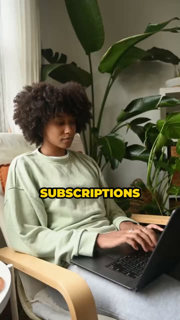
It’s easy to forget, because your editor shows a clean frame. The feed doesn’t. A caption set neatly along the bottom edge of your timeline ends up underneath your own description, and a logo tucked into the top corner lands under the search icon.
The picture itself can run to every edge. It’s only the things people must read or recognise that need protecting: captions, headlines, prices, a call to action, a logo, a face.
How big is the safe zone on each platform?
On a 1080 × 1920 video, Reels and Shorts need the most room at the bottom (672 px) and TikTok the least (484 px). All three need the top clear, between 150 and 290 px. The right edge is where they differ most, because that is where the buttons live.
| Edge | TikTok | Reels | Shorts | All three |
|---|---|---|---|---|
| Top | 150 | 270 | 290 | 290 |
| Bottom | 484 | 672 | 672 | 672 |
| Left | 60 | 65 | 60 | 65 |
| Right, beside the buttons | 180 | 65 | 192 | 192 |
| Buttons start, from the top | 800 | 1080 | 840 | 800 |
Where do these numbers come from? Only one of the three is official. Meta publishes its margins for Reels: “consider leaving at least 14% of the top, 35% of the bottom and 6% on each side” free of text and logos (Meta Ads Guide, Instagram Reels). At 1080 × 1920 that works out to 270, 672 and 65 px.
TikTok and YouTube hand out template files rather than figures (TikTok Ads Manager help; Google Ads Help). So the TikTok and Shorts rows are measured from their layouts and rounded up. They’re the margins RapidCreate uses when it lays out a video, which means we’ve had to live with them: treat them as a careful minimum, not a promise.
Why are the three different?
Because each app arranges the same few things in its own way. They all show who posted, what the caption says and which sound is playing, and they all stack their buttons on the right. What changes is how tall and how wide each of those blocks is.
- TikTok keeps a slim top bar (the Following and For You tabs, and search) and a fairly compact caption block. Its button column is wide, and it starts high.
- Reels has a tall bottom block. The username, the caption and the audio line together take up about a third of the frame, which is why Meta asks for 35%. Its buttons start lowest of the three.
- Shorts needs as much room at the bottom as Reels, for the channel name, the Subscribe button and the title. It also has the widest button column.
A long caption makes things worse. Every platform expands the description upwards when it runs to several lines, so a video with a long caption loses more of its bottom edge than the minimum suggests.
Where do the buttons actually start?
Lower than most templates suggest. The like, comment and share column doesn’t run the full height of the frame. It starts about 40% of the way down on TikTok and Shorts, and a little over halfway down on Reels.
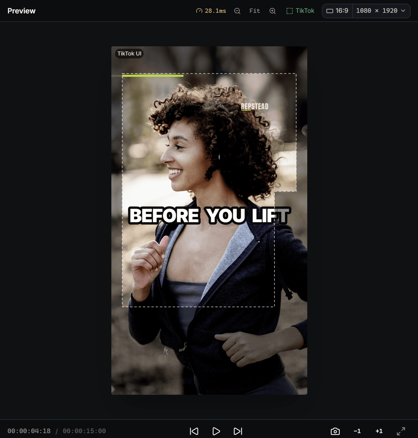
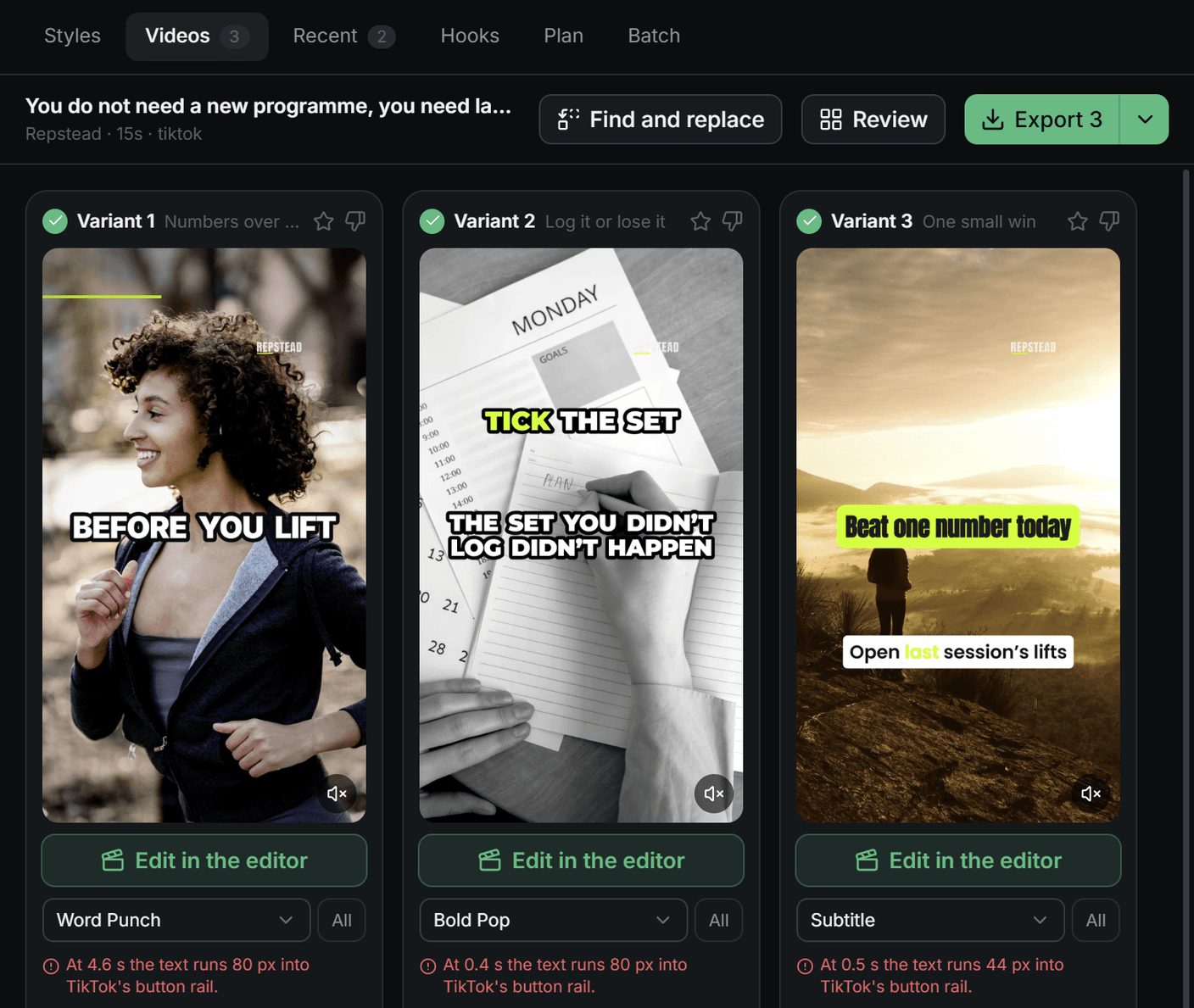
That matters more than it sounds. Most safe zone templates draw one plain rectangle, which treats the whole right edge as off limits. But above the point where the buttons begin, the right margin only needs to be as narrow as the left. A headline in the upper part of the frame can run almost the full width, while captions lower down have to stop short of the buttons.
So the true safe area isn’t a rectangle. It’s a rectangle with a notch cut out of its lower right corner. The checker below draws it that way, and it’s how RapidCreate decides how wide a block of text may be at each height.
What is the safe zone for all three at once?
Take the strictest margin on each edge: 290 px at the top, 672 px at the bottom, 65 px on the left and 192 px on the right, with the buttons starting 800 px down. Text inside that area is clear on TikTok, Reels and Shorts together.
That leaves a working area a little under 960 px tall on a 1920 px frame. It sounds tight, and it is. Half the frame is yours for words; the rest is for the picture. If you post the same file to all three platforms, design for this combined zone from the start rather than fixing three versions later.
Is it worth making a separate cut for each platform instead? Rarely. The gain is about 190 px at the bottom on TikTok, and a caption that sits lower there than everywhere else. For most people, one file that’s right everywhere beats three that are each slightly better.
How do you check your own video?
Drop a frame or the whole video into the checker. It draws the bands for the platform you choose over your own picture, so you can see at once whether a word has slipped underneath. Nothing is uploaded: the file is read in your browser and stays on your computer.
Platform
Or drop a file on the phone. It is read in your browser and never uploaded.
| Edge | Pixels | Share of the frame |
|---|---|---|
| Top | 150 px | 8% |
| Bottom | 484 px | 25% |
| Left | 60 px | 6% |
| Right, beside the buttons | 180 px | 17% |
| Buttons start, from the top | 800 px | 42% |
Switch between TikTok, Reels, Shorts and All three to compare. If you’d rather check inside your editor, download the overlay as a transparent PNG, put it on a track above your video, and line your text up against it. Remember to hide it before you export.
What should go inside, and what can run to the edge?
Keep inside the zone anything that carries meaning on its own:
- Captions and subtitles
- Headlines and on-screen titles
- Prices, dates and offer details
- Your logo or watermark
- A call to action, such as a handle or a web address
- Faces, when the face is the point of the shot
Let these run to the edge: background footage, colour, texture, and anything decorative. A video that shrinks its picture to fit the safe zone looks small and boxed in. The safe zone is a rule for words, not for pictures.
Which mistakes come up most?
Four of them, again and again.
Captions set too low. The most common by far. A caption placed in the bottom fifth of the frame looks right in the editor and vanishes behind the description once posted. Lift captions to just above the bottom band.
A logo in the top corner. The top bar takes 150 to 290 px. A small logo up there sits under the tabs or the search icon. Bring it down below the band, or put it on the end card instead.
Text that hugs the right edge. Left-aligned text that runs wide collides with the buttons from the middle of the frame down. Centre it, or narrow the block.
Trusting one platform’s template for another. A video laid out against TikTok’s zone loses nearly 190 px of its bottom text on Reels. If the file is going to more than one place, use the combined zone.
Sources
- Meta Ads Guide, Instagram Reels (video ad specs), retrieved 12 October 2026: facebook.com/business/ads-guide
- TikTok Ads Manager help, TikTok Auction In-Feed Ads, updated June 2026, retrieved 12 October 2026: ads.tiktok.com/help/article/tiktok-auction-in-feed-ads
- Google Ads Help, About video ad specs, retrieved 12 October 2026: support.google.com/google-ads/answer/13547298
- TikTok and YouTube Shorts margins: measured from each app’s layout at 1080 × 1920 and rounded up; they are the figures RapidCreate lays its own videos out with.
Questions
What is the TikTok safe zone at 1080 × 1920?
Keep text out of the top 150 px, the bottom 484 px, the left 60 px and the right 180 px beside the buttons, which start about 800 px down. TikTok publishes templates rather than numbers, so these margins are measured from its layout and rounded up.
What is the Instagram Reels safe zone?
Meta’s guidance is to keep about 14% of the top, 35% of the bottom and 6% of each side clear. On a 1080 × 1920 video that is 270 px at the top, 672 px at the bottom and 65 px at each side.
What is the YouTube Shorts safe zone?
Keep text out of the top 290 px, the bottom 672 px, the left 60 px and the right 192 px beside the buttons, which start about 840 px down. YouTube does not publish figures, so these are measured from its layout and rounded up.
Can one video be safe on all three?
Yes. Use the strictest margin on each edge: 290 px at the top, 672 px at the bottom, 65 px on the left and 192 px on the right at 1080 × 1920. Text inside that area is clear on TikTok, Reels and Shorts.
Free tool: TikTok Safe Zone Checker
What to read next
Platforms and specs
Vertical video size for TikTok, Reels and Shorts: one export for all three
The size, shape, frame rate and file type that TikTok, Instagram Reels and YouTube Shorts all accept, what each platform’s own pages say, and an export checklist.
The RapidCreate team5 min read
Carousels and posts
How to make a carousel post: a slide-by-slide structure
What goes on each slide of a carousel, how many slides to make, how much text fits, and how to get the same post onto Instagram, LinkedIn and TikTok.
The RapidCreate team8 min read
Carousels and posts
Instagram carousel size: dimensions, ratios and the 20-slide limit
The size to make Instagram carousel slides (1080 × 1350), the taller 3:4 option, what Instagram’s help pages say about ratios and cropping, and the 20-slide limit.
The RapidCreate team4 min read