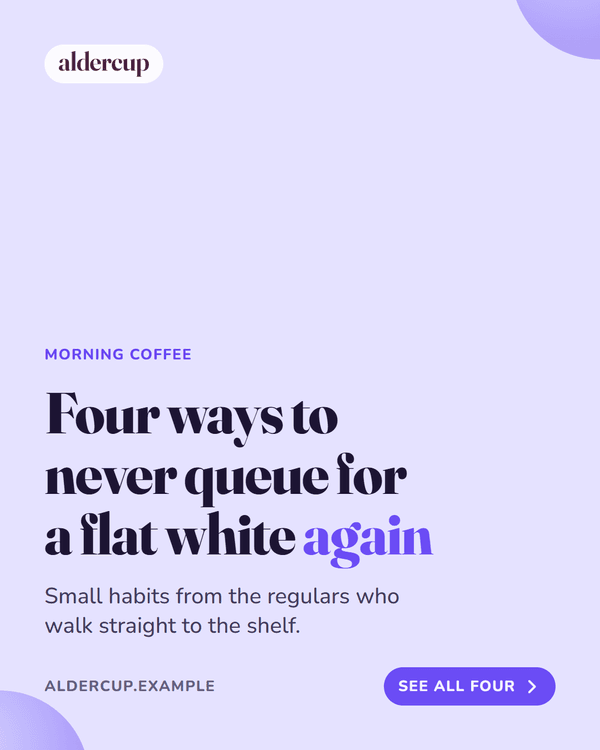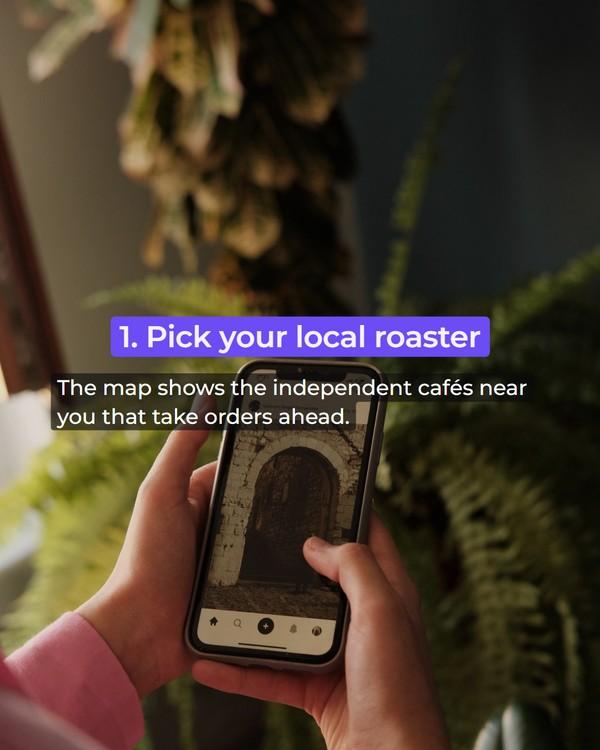
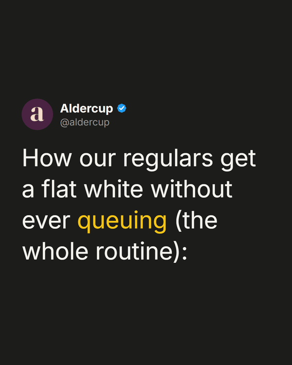
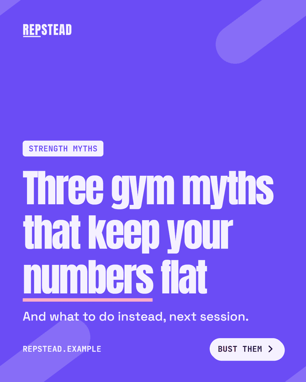
The first slide: how to write a carousel cover that gets the swipe
Everyone who sees your carousel sees the first slide; most see nothing else. Here is what a cover should promise, how long its headline should be, how to show there is more behind it, and why the second slide matters too.
The RapidCreate team6 min read
In this post 11 sections
Key takeaways
- The cover is a hook that holds still: one specific promise, not the name of the subject.
- Six to ten words is about right. Every extra word makes the type smaller.
- Show there is more: a swipe label, a slide count, or a shape that runs off the right-hand edge.
- Instagram may reshow a carousel opening on its second slide, so slide two needs a headline of its own.
Why does the first slide matter so much?
Because it’s the only slide everyone sees. A carousel sits in the feed as its first slide, exactly like a single picture. Whoever stops gets slide two. Whoever doesn’t has, as far as you’re concerned, seen the whole post.
So the first slide has a different job from the others. The body slides inform. The cover persuades. It has to say what the carousel is about, give a reason to care, and make it obvious there’s more, all in the time it takes a thumb to pass.
That’s the same job a hook does at the start of a video. Meta describes a hook as what grabs and holds attention “in the first few seconds” (Meta for Business, The Science of the Hook, December 2025). A cover is a hook that holds still.
What should the cover say?
One specific promise. Not the subject of the carousel but what the viewer will have by the end of it.
Compare two covers for the same post:
- “Email marketing tips”
- “5 subject lines that got our emails opened”
The first names a subject. The second says how many, says what kind, and implies a result. A viewer knows exactly what the next five slides hold and can decide whether they want it.
The formulas that work for video hooks work here, for the same reasons:
| Formula | Example |
|---|---|
| Question | What if you’re doing meal prep wrong? |
| Count | 3 mistakes you’re probably making with meal prep |
| POV | POV: you finally figured out meal prep |
| Command | Stop overthinking meal prep |
| Mistake or myth | The mistake with meal prep that costs you the most |
| Contrarian | Nobody tells you this about meal prep |
| How to or why | How to get better at meal prep in 30 seconds |
A count is the most natural fit, because a carousel really is a numbered list and the number tells the viewer how long it is. A mistake or a myth works when your audience suspects they’re doing something wrong. A question works when the answer isn’t obvious. “How to” is the plainest and needs a number or a result to lift it.
How long should the headline be?
Short enough to set large. On a cover, length and size trade against each other: every extra word makes the type smaller, and small type on a cover doesn’t get read.
RapidCreate’s Post Studio allows a hook headline up to 90 characters, with an optional second line of up to 140 beneath it. Treat 90 as a ceiling. The covers that work best run to about six to ten words, which is also the range the app’s hook score rates highest for a video’s opening line: 4 to 12 words.
If the idea won’t fit, split it. Put the promise in the headline and the qualifier in the line under it:
- Headline: “5 subject lines that got opened”
- Under it: “From 40 sends to a list of 12,000”
The headline does the stopping. The second line does the convincing.
Try a few
Type your topic and the generator fills each formula with it and scores the results. It was built for video hooks, but a cover headline is the same sentence doing the same work. Pick the strongest shape, then rewrite it in your own words.
Hooks from a topic
Score a hook
Type a hook, or choose one from the list, to see its score and the reasons behind it.
A cover can break one of the scorer’s rules safely. Capitals throughout read as shouting in a spoken hook; on a designed cover, a headline set in capitals is a style, not a shout. Judge that one by eye.
How do you show there’s more to swipe?
Tell the viewer, and then show them. A cover that looks finished gets treated as a single picture.
Say it. A small “Swipe” label or an arrow at the right-hand edge. The Post Studio’s hook slide has a swipe button for this, held to 22 characters so it stays a label and never becomes a sentence.
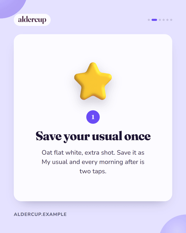
Count it. “1 / 7” in a corner. It promises an end, and people start what they can see the end of.
Cut something off. Let a shape, a line or a picture run off the right edge of the cover and continue on slide two. This is the strongest cue of the three, because it works without being read. The eye sees half a circle and wants the other half.
Leave the answer out. If the cover asks a question, don’t answer it on the cover. If it promises five things, don’t show the first one.
Does the second slide matter too?
More than you’d expect, on Instagram. Its head, Adam Mosseri, has explained that when someone scrolls past a carousel without swiping, “we’ll often give that carousel a second chance and automatically move to that second piece of media for the viewer” (reported by Social Media Today, October 2024).
So some people will meet your carousel on slide two, having never seen the cover. That changes what slide two should be. It can’t be a slide that only makes sense after the cover, such as “Here’s why” on its own. It should carry its own headline and be worth stopping for. Treat it as a second cover with the first real point on it.
What should the cover look like?
Like the rest of the carousel, only louder.
- The biggest type in the post. The cover headline should be larger than any title on the slides that follow.
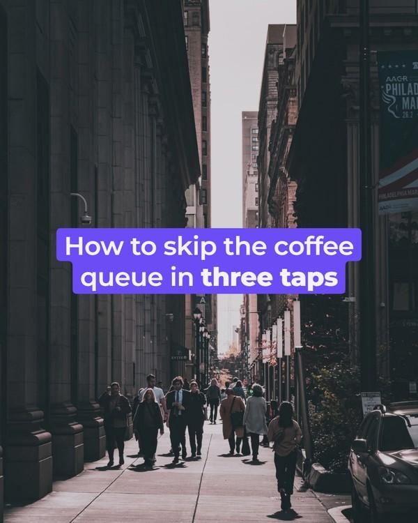
- High contrast. Dark on light or light on dark. A headline over a busy photograph needs a solid band or box behind it.
- One focal point. A headline, or a headline and one picture. Not a headline, a subheading, a logo, a photo, three icons and a badge.
- Your brand, quietly. The same fonts and colours as every other post you make, and a small logo or handle. People should recognise the cover as yours before they read it.
- Room at the edges. On a profile grid a tall post is cropped, so keep the headline towards the middle of the slide.
Which mistakes come up most?
A title, not a promise. “Our Q3 update” names the post. “What we changed in Q3, and what it did to sign-ups” gives a reason to swipe.
Too many words. Past ten or so the type gets small, and a cover in small type is skipped.
Giving it all away. A cover that lists all five tips leaves nothing behind it.
No sign of a second slide. If nothing on the cover says “there’s more”, most people won’t look for it.
A cover that doesn’t match what follows. If the cover promises five subject lines, slide two should be the first subject line. A slide of throat-clearing in between is where viewers leave.
The first slide is a promise
Everything after the cover exists to keep it. If the cover says five, there are five. If it says “the mistake that costs you most”, slide two names it. A cover that overpromises wins the swipe and loses the save, and it’s the save that tells you a carousel was worth making.
Sources
- Meta for Business, The Science of the Hook: How to Supercharge Your Reels Performance, 15 December 2025, retrieved 12 October 2026: facebook.com/business/news
- Social Media Today, IG Chief Recommends Posting Carousels to Improve Reach, 17 October 2024 (quoting Adam Mosseri), retrieved 12 October 2026: socialmediatoday.com
- The character limits and the word range are RapidCreate’s own: the Post Studio’s hook slide and the app’s hook score.
Questions
What should the first slide of a carousel say?
One specific promise: what the viewer will have by the last slide. “5 subject lines that got our emails opened” works where “Email marketing tips” does not, because it says how many, what kind and what result.
How long should a carousel cover headline be?
About six to ten words, so it can be set large. Put any qualifier in a smaller line underneath.
How do I get people to swipe a carousel?
Make a promise on the cover and show that there is more: a small swipe label or arrow, a slide count such as 1 / 7, or a shape or picture that is cut off by the right edge and continues on the next slide.
Does the second slide of a carousel matter?
Yes. Instagram’s head has said a carousel that was scrolled past may be shown again opening on its second slide, so that slide should carry its own headline and make sense without the cover.
Free tool: Video Hook Generator
What to read next
Carousels and posts
How to make a carousel post: a slide-by-slide structure
What goes on each slide of a carousel, how many slides to make, how much text fits, and how to get the same post onto Instagram, LinkedIn and TikTok.
The RapidCreate team8 min read
Carousels and posts
Instagram carousel size: dimensions, ratios and the 20-slide limit
The size to make Instagram carousel slides (1080 × 1350), the taller 3:4 option, what Instagram’s help pages say about ratios and cropping, and the 20-slide limit.
The RapidCreate team4 min read
Carousels and posts
How to make a seamless carousel on Instagram
How a seamless, or panorama, carousel works, the picture size each number of slides needs, where to put the cuts, and a free tool that splits your image.
The RapidCreate team5 min read